Thursday, 24 October 2013

Create Fancy ListViews

Along this post we will display a list of cheeses. I know this is far from being a great set of data (especially for a guy that never eat cheese like me). The reason for this is I preferred focusing on the actual code of the ListView rather the data-fetching code. I’m sure, you can all imagine cheeses as relevant and have enough imagination to consider cheeses like something more ‘accurate’: tweets, Google+ messages, etc.
Our goal in this post is to learn few tips to create well-designed ListView-based applications. ListViews are widely used on the Android platform and must be designed keeping in mind its actual purpose. For instance, the Contact app is regularly used but the time taken by a user to find a contact must be as quick as possible. To fulfill these requirements, the Android team developed a very easy-to-read ListView: clean, containing as few texts as possible, large texts, plain background color, white texts on black background, etc. Even if this is great for the ‘Contact’ app, this is not a perfect and generic solution. Conversely, the ‘Messages’ app contains a ListView designed to be used as often but in a slower way, rarely flinged, differentiating each participant of a conversation, etc. The solution to this problem has been to create a ListView with various background colors, a small but readable font, using grey color for less important information, etc. In other word, a smooth ListView is not enough: you have to design it constantly thinking about the way your customers will use it.

The starting point

Let’s start by creating a ListActivity displaying our list of cheeses. The first step is to create a layout containing ourListView. The code below shows you the layout we will be using afterwards in this article. You can also find a graphic representation of this layout in the screenshot below.
1
2
3
4
5
6
7
8
9
10
11
12
13
14
15
16
17
18
19
20
21
22
23
24
25
26
27
28
29
30
31
32
33
34
35
36
<?xml version="1.0" encoding="utf-8"?>
<LinearLayout xmlns:android="http://schemas.android.com/apk/res/android"
    android:layout_width="fill_parent"
    android:layout_height="fill_parent"
    android:orientation="vertical" >

    <ListView
        android:id="@android:id/list"
        android:layout_width="fill_parent"
        android:layout_height="0dp"
        android:layout_weight="1" />

    <LinearLayout
        style="@android:style/ButtonBar"
        android:layout_width="fill_parent"
        android:layout_height="wrap_content"
        android:orientation="horizontal" >

        <Button
            android:layout_width="0dp"
            android:layout_height="fill_parent"
            android:layout_gravity="center_vertical"
            android:layout_weight="1"
            android:onClick="onDrawSelectorOnTop"
            android:text="@string/draw_selector_on_top" />

        <Button
            android:layout_width="0dp"
            android:layout_height="fill_parent"
            android:layout_gravity="center_vertical"
            android:layout_weight="1"
            android:onClick="onUseSelectorAsBackground"
            android:text="@string/use_selector_as_background" />
    </LinearLayout>

</LinearLayout>
As you may have noticed, the layout contains a ‘bottom bar’ with two Buttons. We could have created a very basic layout … or even not creating one at all and letting the ListActivity create a full-sized ListView but we will actually use those Buttons in the rest of this post to switch between different ‘styling’ methods.
The code of our basic ListActivity is given below:
FancyListActivity.java
1
2
3
4
5
6
7
8
9
10
11
12
13
14
15
16
17
18
19
20
21
22
23
24
25
26
27
28
29
30
31
32
33
34
35
36
37
38
39
40
41
42
43
44
45
46
47
48
49
50
51
52
53
54
55
56
57
58
59
60
61
62
63
64
65
66
67
68
69

package com.cyrilmottier.android.listviewtipsandtricks;

import android.app.ListActivity;
import android.os.Bundle;
import android.view.View;
import android.view.ViewGroup;
import android.widget.BaseAdapter;
import android.widget.TextView;

import com.cyrilmottier.android.listviewtipsandtricks.data.Cheeses;

public class FancyListActivity extends ListActivity {

    private FancyAdapter mFancyAdapter;

    @Override
    protected void onCreate(Bundle savedInstanceState) {
        super.onCreate(savedInstanceState);
        setContentView(R.layout.fancy_list);

        mFancyAdapter = new FancyAdapter(Cheeses.CHEESES);
        setListAdapter(mFancyAdapter);
    }


    private class FancyAdapter extends BaseAdapter {

        private String[] mData;

        public FancyAdapter(String[] data) {
            mData = data;
        }

        @Override
        public int getCount() {
            return mData.length;
        }

        @Override
        public String getItem(int position) {
            return mData[position];
        }

        @Override
        public long getItemId(int position) {
            return position;
        }

        @Override
        public View getView(int position, View convertView, ViewGroup parent) {

            TextView result;

            if (convertView == null) {
                result = (TextView) getLayoutInflater().inflate(R.layout.text_item, parent, false);
            } else {
                result = (TextView) convertView;
            }

            final String cheese = getItem(position);
            result.setText(cheese);

            return result;
        }

    }

}
If we look at the overall appearance of this UI, we have a very basic ListView with a black background. When the user taps an item, the background of this itemview turns orange while the text turns black. Where do those colors come from? In the source code of our application, there is no reference to colors nor Drawables. The actual reason is all styles come from the Application/Activity theme. As we have set no theme to our application, the default theme (@android:style/Theme) is used.

List selector

Let’s start customizing our ListView! The first thing we can change from the default theme is the color of the pressed itemview. In order to do that, we will use the android:listSelector XML attribute which is equivalent to theListView.setSelector(int) method. The list selector is a Drawable drawn by the ListView as the background of the pressed/focused itemview. The ListView manages all types of Drawables but the preferred Drawable is usually the StateListDrawable. This Drawable changes its appearance based on its current state (focused, pressed, selected, etc.). The capture below shows the list selector we want to develop in the focused and pressed states:

In this example, we will create a brand new list selector that displays a nice gradient beneath the pressed/focused itemview. The first thing we need to do is to create two GradientDrawables: the first one for the pressed state and the second one for the focused state. The GradientDrawables below are respectively called list_selector_pressed.xmland list_selector_focused.xml and can be found in the res/drawable folder:
list_selector_pressed.xml
1
2
3
4
5
<shape xmlns:android="http://schemas.android.com/apk/res/android" android:shape="rectangle">

    <gradient android:endcolor="#ffc579" android:startcolor="#fb9d23" android:angle="90"></gradient>

</shape>
list_selector_focused.xml
1
2
3
4
5
<shape xmlns:android="http://schemas.android.com/apk/res/android" android:shape="rectangle">

    <gradient android:endcolor="#f7ddb8" android:startcolor="#f5c98c" android:angle="90"></gradient>

</shape>
We can now create our own list selector that references the two previous Drawables (this is where the magic happens). This file is located in the res/drawable folder and its name is list_selector.xml:
list_selector.xml
1
2
3
4
5
6
7
<selector xmlns:android="http://schemas.android.com/apk/res/android">

    <item android:state_pressed="true" android:drawable="@drawable/list_selector_pressed" />
    <item android:state_focused="true" android:drawable="@drawable/list_selector_focused" />
    <item android:drawable="@android:color/transparent" />

</selector>
The only thing we need to do now is to apply this brand new list selector to our ListView. You can do it by adding android:listSelector="@drawable/list_selector" to the ListView tag in your layout.
Note: Using a color as part of your list selector may entirely fill your ListView. This problem comes from the fact a ColorDrawable does not respect its bounds: it entirely fills the clip rect of the Canvas in which it is drawn into. I have always considered this as a bug but nothing has been fixed until … Android 3.0 (Honeycomb)! As a result, using a ColorDrawable in your list selector is strongly discouraged. Fortunately, this article is entitled ‘ListView tips & tricks’ and here is an easily way to get round this bug: instead of setting a ColorDrawable, use a Drawable that respect its bounds such as a GradientDrawable or a NinePatchDrawable. The code below shows a GradientDrawable that can be used in replacement of a regular ColorDrawable.
list_selector.xml
1
2
3
4
5
<shape xmlns:android="http://schemas.android.com/apk/res/android" android:shape="rectangle">

    <solid android:color="#fb9d23"></solid>

</shape>

Miscellaneous styling

ListViews provides a lot of “styling” features. In this paragraph we will focus on various methods that may be used to style your ListView. Please note those most of those tips are given “as it” and are not part of the sample code.

Cache color hint

By default, an Android View has a transparent background. Although it seems natural … transparency involves a lot of calculation when rendering your application on screen. In order to avoid blending and make the rendering faster while scrolling/flinging, the ListView widget uses a ‘scrolling cache’ mechanism. This mechanism consists on taking an opaque screenshot of all visible child Views (in other words, it draws the content of each itemview in a Bitmap) and directly draws those screenshots when necessary. The color used to make those screenshots opaque is the one given by the cache color hint. If your ListView turns opaque (black for instance) when scrolling that because you need to set the cache color hint to the actual color of your ListView background. Setting this property @android:color/transparent will fix the problem but will also disable the optimization …
If you want to know more about the cache color hint optimization I strongly recommend you to have a look at a really great article written by Romain Guy. You can read it on the Android Developer Blog

Divider

Contrary to the ScrollView widget, ListView has a built-in support for dividers. By default, a divider is a 1-pixel tall line that is used to separate two itemviews. You can style/modify this property with the android:divider XML attribute. Setting a new divider can be done with a color or a Drawable. When drawing the content, the ListViewwill automatically look at the height of the divider to part the itemviews. In other words, it means you can use a very complex Drawable as divider and your ListView will automatically measure it and draw it when necessary.
This looks amazingly powerful and easy, isn’t it? It actually is … but there is little a problem. Some Drawables (for instance the ColorDrawable) has no intrinsic height (which means a call to Drawable.getIntrinsicHeight()returns -1). In order to by-pass this problem, ListView provides a android:dividerHeight XML attribute that asks for a dimension.
Note: The previously detailed problem concerning the un-respected bounds does not apply to dividers. This is odd, isn’t it? Indeed, ListView has an internal mechanism clipping the Drawable to the correct rectangle on screen when the divider is a ColorDrawable. As a result you can safely use colors when styling your dividers.

Fading edges

By default, a ListView fades away at the top and bottom edges once the content is larger than the actual size of the ListView. This property is called fading edge and can be easily removed or modified using android:fadingEdgeand/or android:fadingEdgeLength. You can look at the sample code of this post in which I have prefered removing this Android feature by adding a android:fadingEdge="none" in the XML attributes of our ListView.

ColorStateList

Sooner, we have discovered a way to create a custom list selector. If you look closely to the image, you will notice the text has a different color between the normal and pressed states. Changing the text color may be mandatory in some cases where the background color of a pressed itemview is very close to the color of the text. In order to change the color of the text depending on the current state of the itemview, you can use a ColorStateList. I will not describe how to use it here but you can take a look at the framework documentation. This class and its use is described very clearly in the Android developer guide

Overscroll Drawables

Since Android 2.3, ListViews gives a visual feedback when the user tries to scroll the content of the ListView over its bounds. This feedback looks like a ‘halo’ at the bottom/top of the ListView. You can set your own Drawableusing one of the setOverscroll[Footer/Header](Drawable) method.

Customizing itemviews background

Changing the background color of a ListView can be rather complex. The next part gives you a few tips and tricks you can use to create eye-candy and unique ListViews. Our goal is to change the background of our UI to a light color. We will also try to emphasize some cheeses by setting the background of their itemview to a more noticeable color. The screenshots below shows our final ListView depending on the method used:

ListView background

The simplest approach of changing the UI background color is to change the background color of the ListView. In order to do that, we simply have to use the android:background XML attribute or one of the setBackground[Color|Resource|Drawable] method.
The main problem with this approach is the background is applied globally. In other words, it means you don’t a control over each itemview as the background applied to the entire ListView. This works particularly great with a plain color but this method will not allow you style two itemviews differently.

Itemviews background

In the previous method, we have chosen to change the background of the entire ListView. If we want to have a control over each itemview appearance it makes sense to change the background of each of our itemviews independently. The code below shows you how to apply a background depending on whether the underlying data is special or not:
1
2
3
4
5
6
7
8
9
10
11
12
13
14
15
16
17
18
19
@Override
public View getView(int position, View convertView, ViewGroup parent) {

    TextView result;

    if (convertView == null) {
        result = (TextView) getLayoutInflater().inflate(R.layout.text_item, parent, false);
        result.setTextColor(Color.BLACK);
    } else {
        result = (TextView) convertView;
    }

    final String cheese = getItem(position);

    result.setText(cheese);
    result.setBackgroundResource(isSpecial(cheese) ? R.drawable.list_item_background_special : R.drawable.list_item_background_normal);

    return result;
}
If you compile and run this example, everything will work perfectly fine … until you try to press an itemview. Indeed, using the previous technique, the customized list selector we created never shows up. It may look like a bug at first but this is actually completely normal. Let’s look at how things are drawn the following diagram (you can click on the image to access to a larger version):
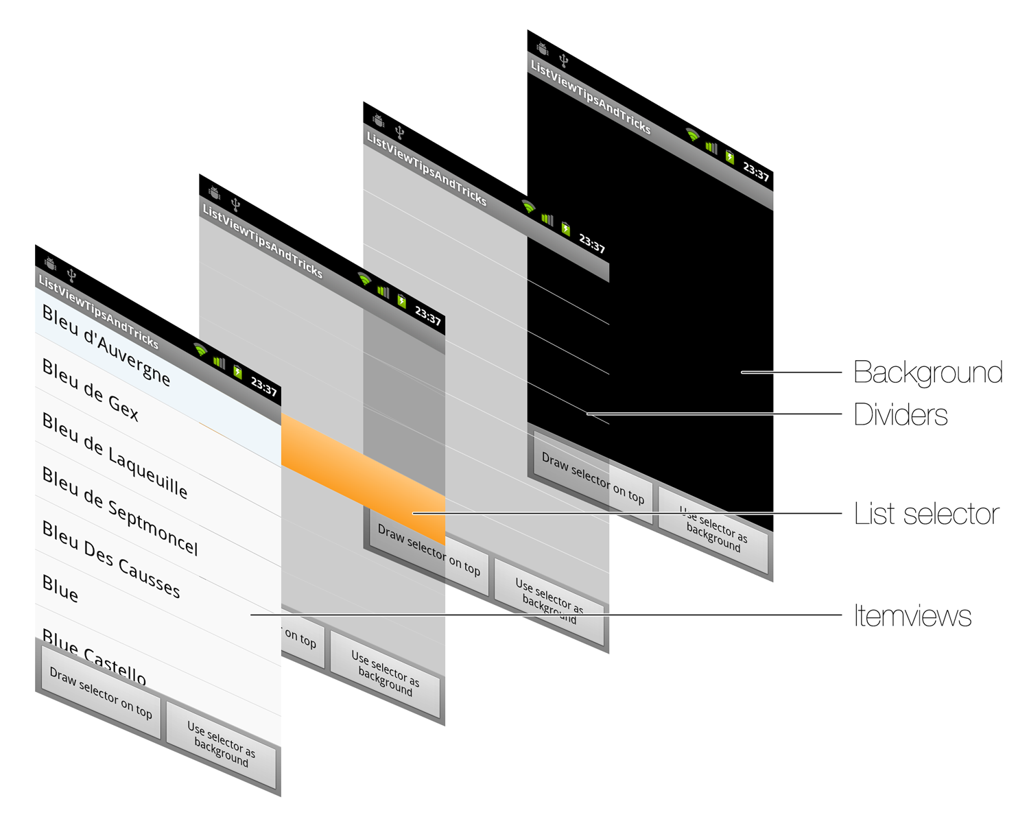
As you can see, Android first draws the ListView background as well as the dividers. Then, the system draws the list selector. Finally, ListView renders all itemviews on top of that. Thanks to this diagram, it is clear the list selector will never be visible with opaque background set to itemviews. Fortunately, I have a listed a few solutions you can implement.

Drawing selector on top

The ListView or more globally the AbsListView offers a android:drawSelectorOnTop XML attribute and its Java equivalent setDrawSelectorOnTop(boolean). As mentioned in the method’s name, setting this property to true will indicate the ListView to draw the selector on top of each itemview. Even if this looks like a good option, drawing selector on top does not allow you to have opaque list selector as the content of your itemview will be completely hidden.

OnItemClickListener and OnItemSelectedListener

I have seen a lot of samples over the Internet using the OnItemClickListener and OnItemSelectedListener in order to be notified the background must be changed to transparent … This can work but I think this is a pure hack considering the features available in the Android framework. Even if this technique is probably great on some mobile platforms could you please guys stop using it on the Android platform. This is not a correct nor easy way to do it on Android. As a result, you can probably guess why there is no line of code in this article explaining the hack.

StateListDrawable

As we have seen previously, our biggest problem comes the fact the background is opaque and hides the list selector when the itemview is pressed. Hence, we need to find a way to make the background transparent when pressed. This looks like something we have already done and some of you may have understood where I want to get to … Hurray, you are right! The trick consists on using a StateListDrawable as the background of each itemview. This Drawablewill have the exact opposite behavior of the list selector: it will be opaque by default and will become transparent when pressed, focused or selected. The code below refers to the list_selector_normal.xml (the list_selector_special.xmlis very similar and is not available here. Look at the sample code for more details):
1
2
3
4
5
6
<selector xmlns:android="http://schemas.android.com/apk/res/android">
    <item android:state_pressed="true" android:drawable="@android:color/transparent"></item>
    <item android:state_selected="true" android:drawable="@android:color/transparent"></item>
    <item android:state_focused="true" android:drawable="@android:color/transparent"></item>
    <item android:drawable="@drawable/list_item_background_normal"></item>
</selector>
This trick can even be pushed to its paroxysm by setting the list selector of your ListView to null or a transparent color and letting each itemview handle the all states itself. You only thing you need to do here is to create a final StateListDrawable containing the background (normal state) as well as the gradient used as visual interaction feedback (pressed/focused state). This method works pretty well and does not suffer from the previously mentioned problem regarding ColorDrawable (the color is drawn at the itemview level not at the ListView level) but it does not force you to have consistent pressed/focused states between your itemviews. Even if it is usually okay to have different Drawable for the ‘normal’ background it is generally not recommended to have different Drawablebetween itemviews.

Conclusion

Although we have just scratched the surface of the styling possibilities, you now have a large set of keys to design eye-candy ListViews. Do not hesitate to use those tips always keeping in mind what the important questions are: “What’s the real purpose on this ListView?”“What are my users’ expectations?”“Do I need to focus on productivity, readability, efficiency or something else?”, etc.
I hope you have appreciated this article. I know it is quite a long post but let’s say this will be the only one I will be posting this month of holidays. Do not hesitate to leave a comment below if you have questions, if you think I have made a mistake somewhere or simply if you want to thank me for this! Have fun styling your ListViews!

Monday, 11 February 2013

Fetching Result from a called activity

For simplicity sake, I use an explicit intent for invoking the child activity. For simple invocation without expecting any data back, we use the method startActivity(). However, when we want a result to be returned by the child activity, we need to call it by the method startActivityForResult(). When the child activity finishes with the job, it should set the data in an intent and call the method setResult(resultcode, intent) to return the data through the intent.


The parent activity should have overridden the method onActivityResult(…) in order to be able to get the data and act upon it.


NOTE: for successful execution of this sequence of events, the child activity should call finish() after setResult(..) in order to give back the handle to the parent activity.


In summary, here are the methods to implement in the parent activity:
  • 1.  startActivtyForResult(..)
  • 2.  onActivityResult(…)

The child Activity should complete the work as usual and finally call:
  • 1.  setResult(…)
  • 2.  finish()

Let us delve into the example downloadable here:


The calling Activity is providing 2 buttons to view books and pens. On selecting one of them, either BooksActivity or PensActivity is called, which displays a list (using ListView) of the selected type of objects. The user can select one and the selected object is returned to the parent for display. (Note: this could be extended into a shopping cart example. I have kept it simple for the tutorial’s sake)


Since we are expecting to get back the selected object, the calling Activity’s code is like this:
     Intent bookIntent = new Intent();                bookIntent.setClass(CallingActivity.this,BooksActivity.class);
      startActivityForResult(bookIntent,BOOK_SELECT);
where BOOK_SELECT is just a constant to help us identify from which child activity the is result obtained, when there is more than 1 child activity, as in this case.


At this point the control is handed over to the BooksActivity. This displays the list of books and the user can scroll through and select a book. When the user selects a book, the selected book needs to be passed back to the CallingActivity. This is how it is done:
      Object o = this.getListAdapter().getItem(position);
      String book = o.toString();
      Intent returnIntent = new Intent();
      returnIntent.putExtra("SelectedBook",book);
      setResult(RESULT_OK,returnIntent);       
      finish();


The first 2 lines show how to get the selected book from the ListView. Then, you create a new intent object, set the selected book as an extra and pass it back through the setResult(…) method call. The result code is set to RESULT_OK since the job has been successfully done.  After that the finish() method is called to give the control back to the parent activity.


In the parent, the method that gets the control is onActivityResult(…)
protected void onActivityResult(int requestCode, int resultCode, Intent data)
      {
      switch(requestCode) {
      case BOOK_SELECT:
            if (resultCode == RESULT_OK) {
                String name = data.getStringExtra("SelectedBook");
                Toast.makeText(this, "You have chosen the book: " + " " + name, Toast.LENGTH_LONG).show();
                break;
            }
      ……….
      }
      }  


Here you notice that the BOOK_SELECT constant is used to act upon the result. If the result code is RESULT_OK, we take the book selected from the “extra” of the intent that is returned from the child activity. data.getStringExtra("SelectedBook") is called to and the name returned is displayed through a Toast.

Tuesday, 10 July 2012

How to best organize your Android source?


One thing that can certainly speed up your development tasks when doing Android projects, is to reuse your Android source code. To do that, it is important to make sure that your Android source code is well organized and easy to find and reuse when you need it. Many of us are forgetting this, when things go fast, and we have to make deadlines. But if you take a little time to find some routines and methods that suits you, it can actually help you reach your deadlines in a lot more comfortable way. If you have ever found yourself writing code, feeling some kind of deja-vu, this post is for you.
There is a few different resources that will be good to keep handy, and to reuse. This includes Java classes, resources (graphic, sound and other assets) and sometimes layouts. The best way to do this, is to use library projects. You could also compile your code into static jars, which is great if you need to share your code with others, without revealing your source.
A library project can contain all of these resources – Java source, assets and XML.

Java source

This is probably the primary thing that you want to reuse and/or share. This would often be your own extension to some classes or libraries. Maybe you wrote your oven ArrayAdapter extension, that you would love to be able to easily reuse and extend further in other projects. Or you made some heavy maths, that you would not want to spend 3 nights writing again.

Resources

Resources like graphics and sounds is often very specific to an application. However, there might be stuff that you would like to be able to easily reuse in other projects. This could be some bullets, frames, background images, list item assets or others. Things that are not necessarily very specific to a single application. If you develop games, it could be some bells, boings or whistles.

XML

This would primarily be layouts, and often be related to entire components, like a specific view that you made, or a widget. It could also be menus, strings and so on.

Organizing your Android source library projects

There is probably as many ways to split up your code into projects, as there is developers around. My approach is to split it up as much as it makes sense to do. That means, do not mix multiple components in one project, but if you make a component, put all of your code in a single project.
1. Specific components. This could be your own TabHost implementation. Or a custom Dialog. If you make such components, the best way to stay organized is to create one library project for each of your components. With that exception, that you might have some very small UI extensions or components, that it does not make sense to put in a project of its own. So, make a UIToolsLibrary with your small comonly used UI tools, and then go for a full library when creating larger components. The way you mix this depends on how you feel about it.
2. Tools. Examples are simple classes or extensions. Maybe an extension to Activity, or other classes. It could also be your own utility methods, like specific math functions, or calculations. You might also want to create multiple libraries for this, for instance your own math library, or your own graphics library. Again, how you organize this is much up to your own feelings. But be ware, that as your code base grows, you will be happy to have started out with an approach that splits up things a lot. A good approach is to create a core tools library, that contains small utility classes related to Android, and then create a library for each of the areas that you are working with.
3. Resources. As mentioned above, resources like graphic and sound are often not reusable. However, if you create a lot of applications, you might want to have some resources handy. The Android SDK has some resources for menus, icons and tabbars. Likewise, you might want to create your own.
4. Layouts. This will often be related to a specific component, and as such rarely be a good idea to create a specific project for these. However, if you do a lot of code, it could be wise. If you have your own ListView items, or custom Dialog boxes, it could make sense. I would, however, put these in the resource project instead.

Creating a library project

Using Eclipse and ADT, this is how you do it:
1. Select File->New->Project
2. Select Android -> Android Project, and click next
New Library project
Type in a project name, application name and package name. Application name would probably be the same as your project name. Select Create Activity and type in an activity name if you wish to create an activity. For this example, we do not. Click Finish.
3. Right-click your project in the Project Explorer, and click Properties. Select Android.
Android Project Properties
The only thing that you has to do here, is select “Is Library”. Then click OK.
Now you can start adding code to your project. Let’s create a small class.
4. Create a class – let’s call it TestClass, and extend Object. In here, create a simple static method:
public class TestClass {
    public static String combine(String a, String b) {
        return a + b;
    }
}
Now save this, and build your library. Our small class is now ready for use in our applications.

Using your libraries

After creating a library, you can start using it.
1. Right-click your application project in the Project Explorer, and select Properties. Select Android.
2. In the Library section, click Add, and your library project (if it is still open) should appear in a dialog. Select it, and click OK.
Select Library Project
3. In your application code, you can now use the TestClass class. Try it out:
String test = TestClass.combine("Hello"" World");
Log.i("Test", test);
The same way, when you include resources and layouts in your library, you can reference it from the application where you include the library.